Celebrating over 30 years
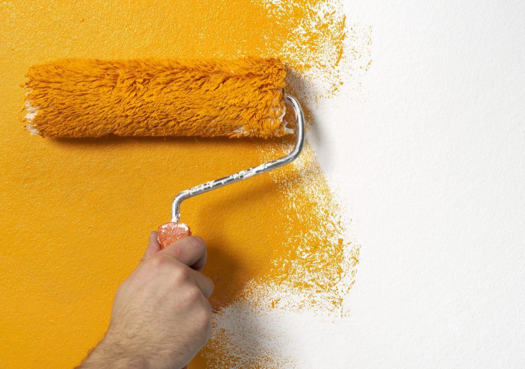
Best Interior Paint Colors for 2017
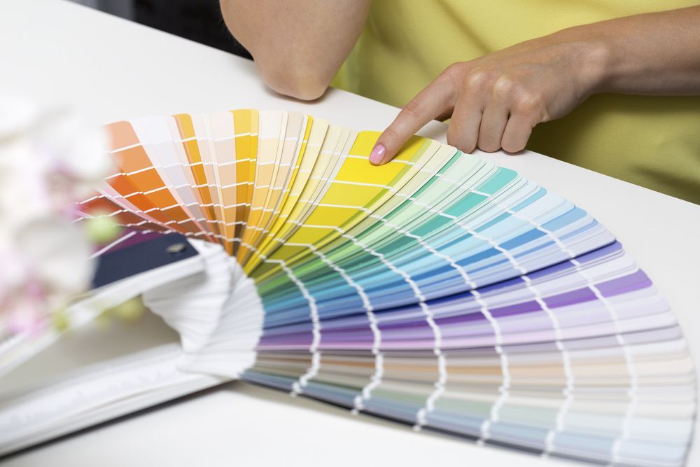
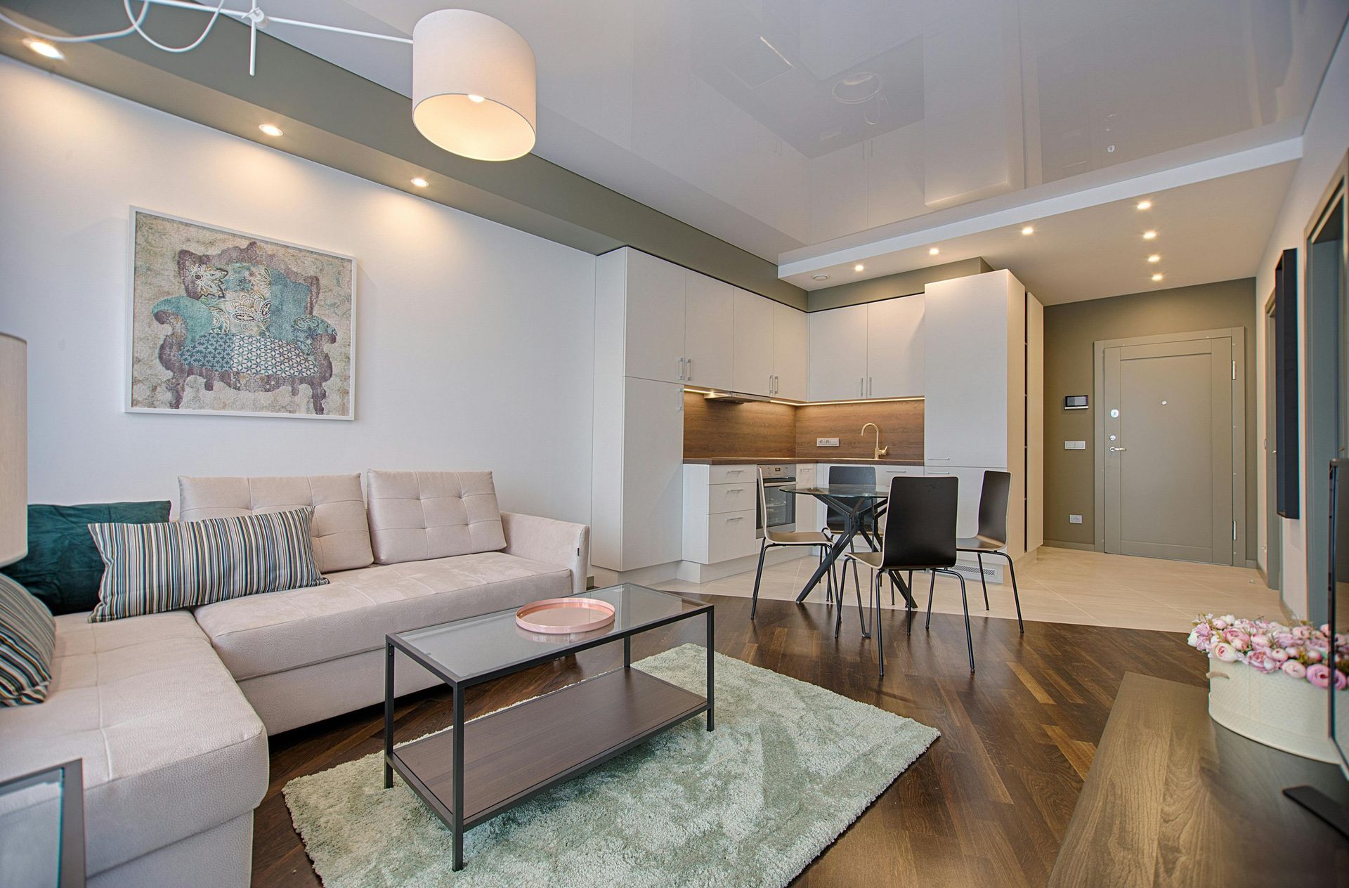
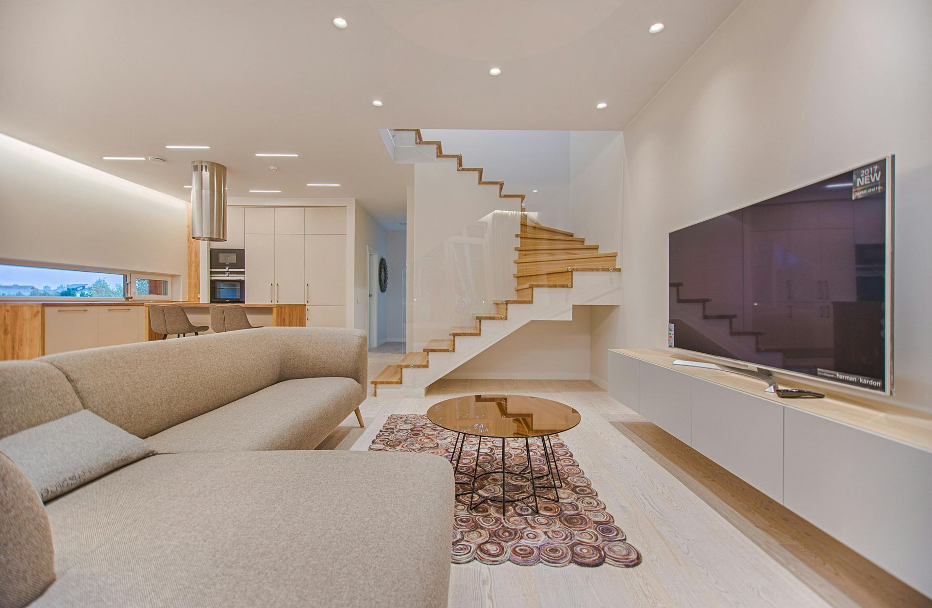
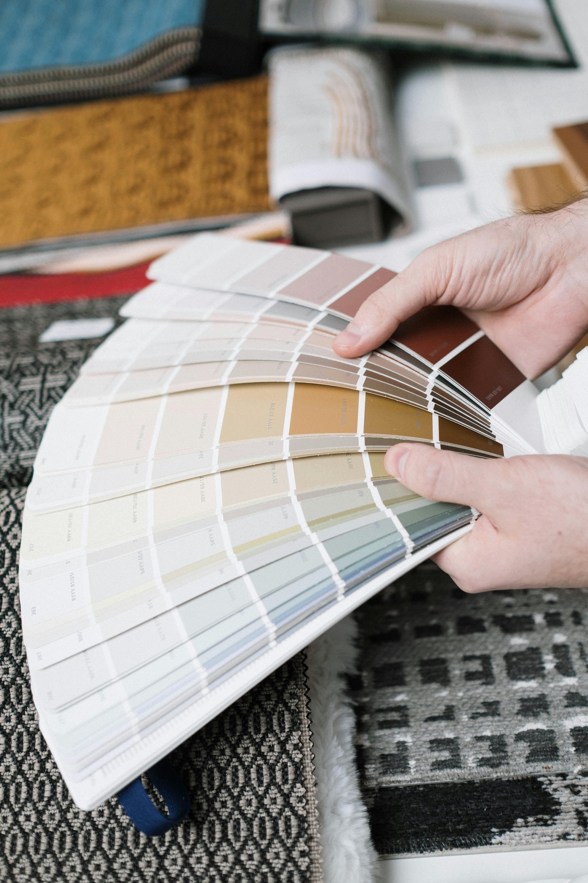
Colors influence our mood and can bring about a nice change not only in our homes but also in our inner thoughts. Have you ever felt agitated in a red room, or anxious in an unbelievably white décor? That’s because, at a very subtle level, colors can cast us in a different state of mind, awakening certain emotions that we were not even aware of. Being in the presence of certain hues can lower or even drain your energy level while other shades can noticeably elevate your spirit.
The idea is to surround yourself with the colors that make you feel good. When it comes to interior paint, choose a range of hues you know will enjoy seeing every day.
2017 Is All About Finding the Colors That Fit Your Personality
The science of color psychology has evolved into the new trends of 2017, with both producers and interior designers following the human personality traits to dictate a “chromatic category” you are predisposed to fit into.
Behr , one of the big players in the paint industry, has divided this year’s newcomers into three palettes – Confident , Composed and Comfortable – that aim to match your temperament with the right color scheme.
- Confident: As the names suggest, if you tend to be the outspoken social type you might find that dark blues, spicy reds, and lime greens complement your personality best.
- Composed: More down to earth individuals are likely to feel centered around earthy greens and deep taupes in the Composed collection.
- Comfortable: The more reserved and introvert personalities will find their comfort in the range of subdued pinks, blues, and yellows to make an accent.
Get Inspired from Pantone’s Predictions
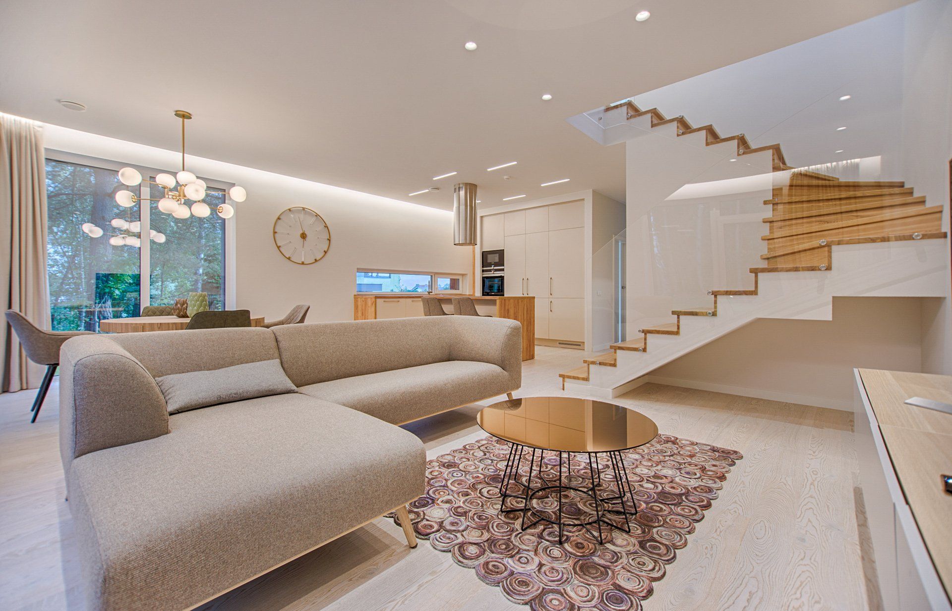
If you don’t necessarily mean to make your personality stand out on the wall, but are just looking for new inspiration to update your home, we suggest you pay attention to the trend predictions made by Pantone. Since 2000, the Pantone Color Institute has been deciding the “ color of the year ” by reuniting different professional industries – from printing to painting – at one single table. The unanimous decision is long awaited by numerous other industries in the world, such as the fashion world, that in turn think of their collections in the new Pantone terms.
So what is the color of 2017? Greenery , which the Pantone Institute itself defines as a fresh color that sends us back to the first days of spring. After all, who wouldn’t want to a take a deep breath of fresh air just by looking at their nature-inspired décor?
Producers have indeed complied with pigments that follow a very natural feel: rich taupe shades – a variable mixture of gray, brown and beige – that take center stage, earthy green tones that resemble a botanical landscape and hues that bear mouthwatering names such as Crushed Oregano or Honey Glow.
With so many choices, it’s just a matter of finding your inspiration. We are happy to help; give us a call or contact us
to learn about your options!

FITZPATRICK PAINTING & CONSTRUCTION
IS CELEBRATING OVER 30 YEARS IN BUSINESS!
By using our website, you consent to our Cookie Policy, Privacy Policy, and Terms Of Service / Use.
All content Copyright © 2025 Fitzpatrick Painting & Construction Inc. Website by smallbee.com