Celebrating over 30 years

Using Paint to Improve Mood and Wellness: A Guide for Senior Living Facilities
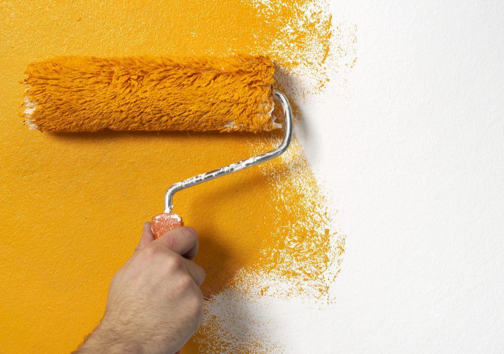
It's no secret that colors have a profound impact on how we experience life. One step outside on a sunny midfall day is enough to prove it. And yet, many senior living facilities are painted with little consideration of color or placement. Just choose something that looks nice, right? Well, yes. But there’s more to it than that.
The Psychology of Color in Senior Living Environments
Color psychology is the science that shows how certain colors impact mood and energy. For example, a vibrant (but not too vibrant) yellow is going to generally make people feel more comfortable than a dark red tone or black.
Color psychology is important to keep in mind for any interior painting project, but it's all the more so when considering what tones to use for senior living facilities. Thoughtful color selection can create spaces that not only support residents' daily activities but also make them feel at ease.
Choosing Colors for Wellness and Uplifting Mood
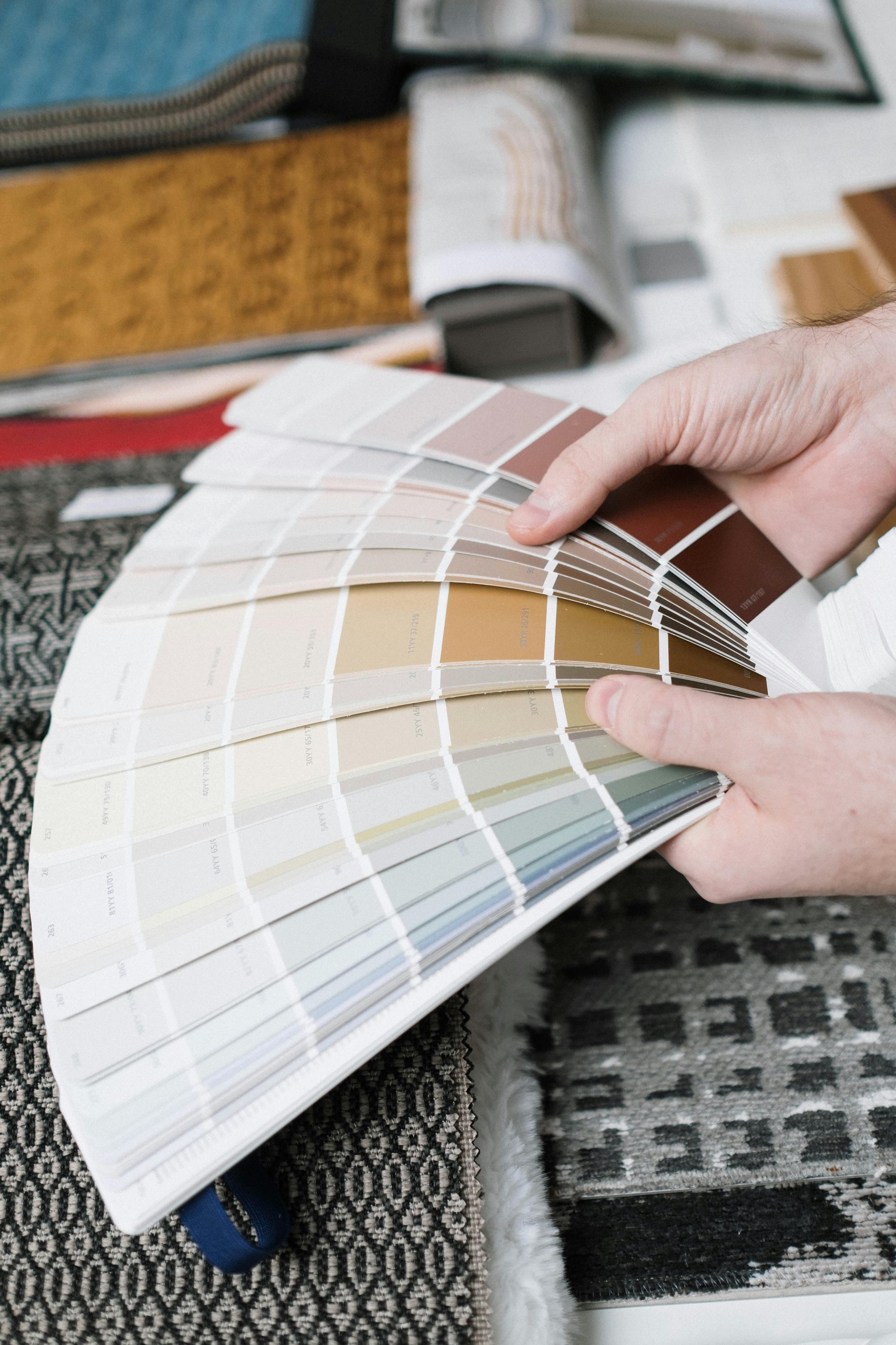
So, the question now is: “What paint colors aid in emotional wellbeing and where should they go?” If you’re asking that question as an assisted living personnel or facilities manager, you are on the right track! Let's break it down.
Soothing Tones for Calm Environment and Relaxation
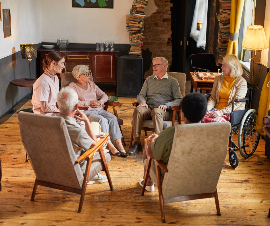
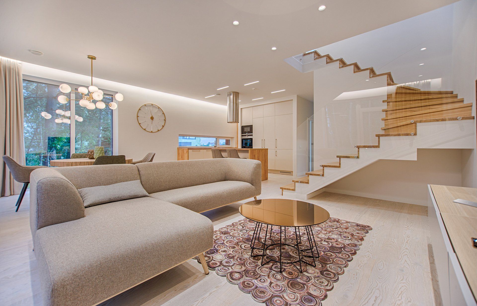
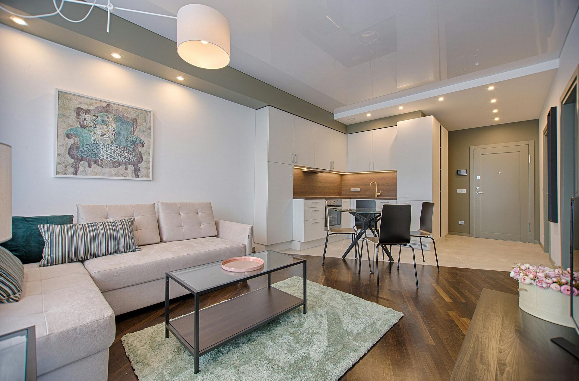
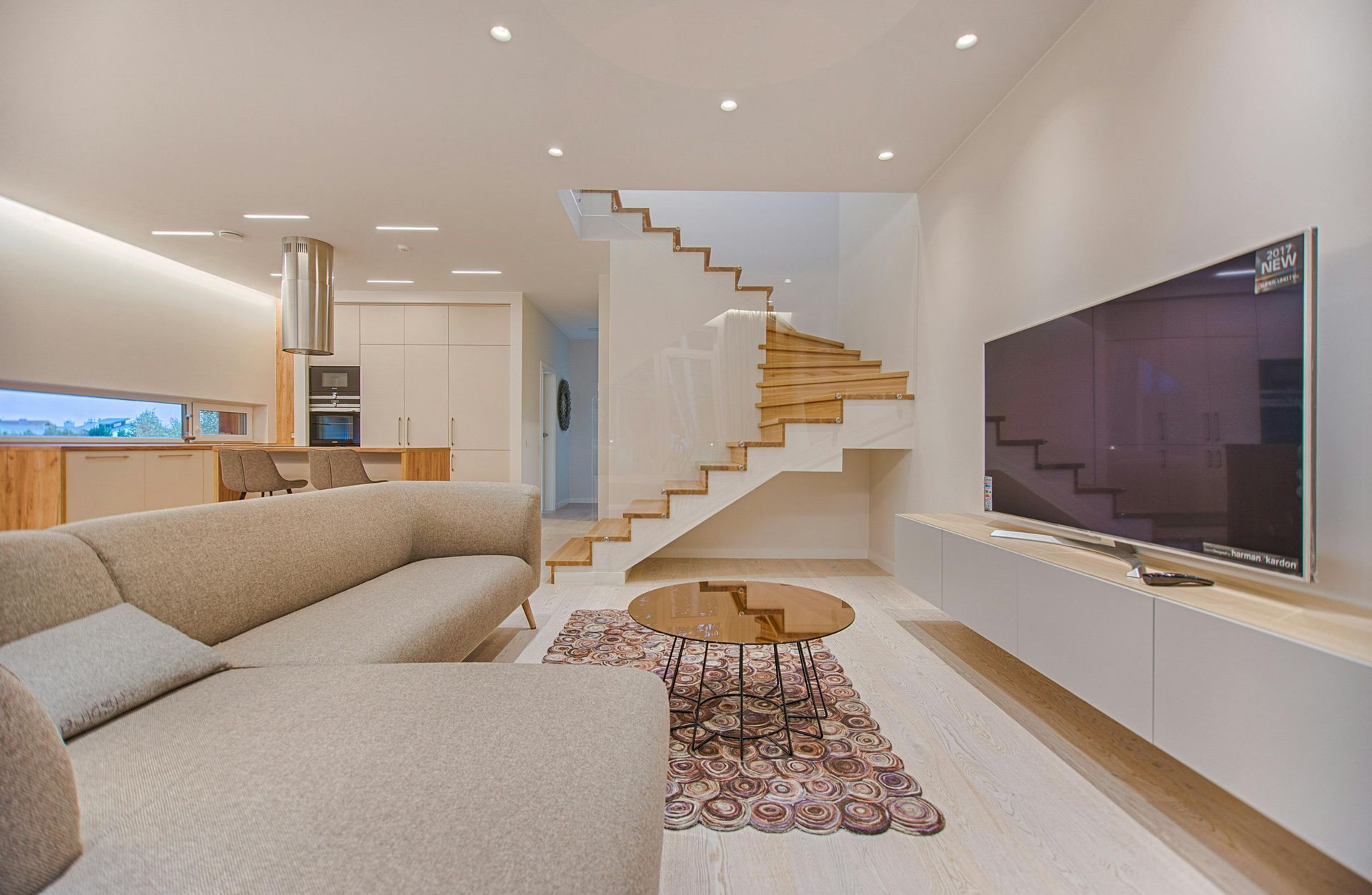
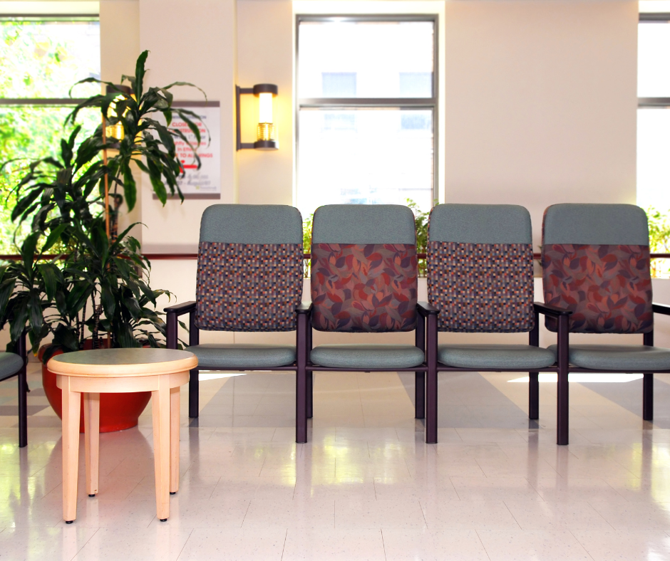
Bedrooms, lounges, and other quiet areas benefit from calming colors like blue, green, and beige. These shades can help residents feel more grounded and at ease, offering a peaceful environment where they can unwind. Neutral tones mixed with gentle greens can mimic nature, promoting tranquility and aiding in relaxation.
Energizing Spaces for Activity and Interaction
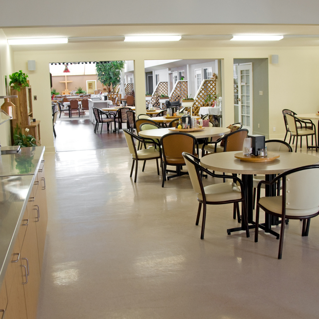
Activity rooms and dining areas may benefit from more vibrant shades, like soft yellows or pastel oranges. These colors can create a sense of warmth and energy, encouraging social interaction and stimulating mental engagement.
But keep in mind, it’s important to avoid overly bright tones that might cause visual strain or discomfort. Soft, warm hues strike a balance between energy and relaxation, making communal spaces inviting and lively.
Safe Navigation and Visual Contrast
Color can also support safety by making it easier for residents to navigate common areas. High-contrast color schemes help individuals with vision impairments distinguish between walls, floors, and furniture. Using colors that contrast with door frames, stair edges, and handrails can increase visibility and aid in navigation.
Creating a Sense of Home and Personal Comfort
Another benefit to thoughtful color selection is the ability to create a homy environment. Many seniors are more at ease in places that feel familiar, so incorporating soft, warm neutrals, as opposed to overly stark or institutional color schemes, may be a good way to achieve that welcoming and hospitable feel.
You can also think strategically about room divisions and accent walls. Many residents share rooms. And no matter how much they may love each other, everybody appreciates personal space. Accent walls can create a sense of division for one side of the room without completely cutting it off. Consider using a bold color on two of the four walls and a lighter tone of the same color on the other two.
Practical Tips for Painting Senior Living Facilities
Before we go, let's talk about some other important considerations when painting a senior living home.
Use Low-VOC Paints for Better Air Quality
Indoor air quality is crucial in senior living environments, and low-VOC (volatile organic compound) paints minimize the release of chemicals that can affect residents’ respiratory health. Choosing eco-friendly, low-VOC paints ensures a cleaner, safer atmosphere for everyone in the facility.
Opt for Durable, Washable Paints in High-Traffic Areas
High-traffic areas like hallways, dining rooms, and activity spaces benefit from washable, durable paints that are easy to clean and maintain. This type of paint can withstand frequent cleaning, helping maintain a fresh look over time and reducing the need for frequent repainting.
Consider Repainting on a Regular Schedule
Since senior living facilities experience high use, they may require
more frequent repainting. Generally, refreshing the paint every 3–5 years can help maintain a clean, welcoming environment. Regular maintenance of painted surfaces helps ensure that colors remain vibrant and effective in creating a positive ambiance.
What's the Takeaway?
In the end, thoughtful painting is one of the keys to creating spaces that promote wellness, comfort, and joy in senior living environments. Each room’s purpose, combined with the intentional application of color and texture, can improve mood and foster a sense of belonging and ease among residents. By considering these aspects, senior living facilities can leverage paint as a powerful tool to enhance both the quality of life and the overall atmosphere of the community. What kind of painting could be better?
Frequently Asked Questions (FAQ)
Q: How often should senior living facilities repaint common areas?
A:
Depending on wear and tear, repainting every 3–5 years can help maintain a fresh, clean look and ensure the colors remain effective for their intended purpose.
Q: Are certain paint types better suited for senior living facilities?
A:
Yes, low-VOC paints are recommended for better air quality. In addition, washable and durable paints are ideal for high-traffic areas to allow for easy cleaning and maintenance.
Q: How does paint choice affect residents with cognitive challenges?
A: For residents with cognitive impairments, calming colors and clear visual contrasts can help create a safer, more navigable environment. Soothing tones can also reduce anxiety, while contrasting colors make navigating easier.


FITZPATRICK PAINTING & CONSTRUCTION
IS CELEBRATING OVER 30 YEARS IN BUSINESS!
By using our website, you consent to our Cookie Policy, Privacy Policy, and Terms Of Service / Use.
All content Copyright © 2025 Fitzpatrick Painting & Construction Inc. Website by smallbee.com